Project Overview:
The goal was to develop a look that supported the messaging and the unpredictable energy of its contestants without misleading the audience with creative that didn’t represent the show. A way to support the trailer and topical promos that were produced throughout the season.
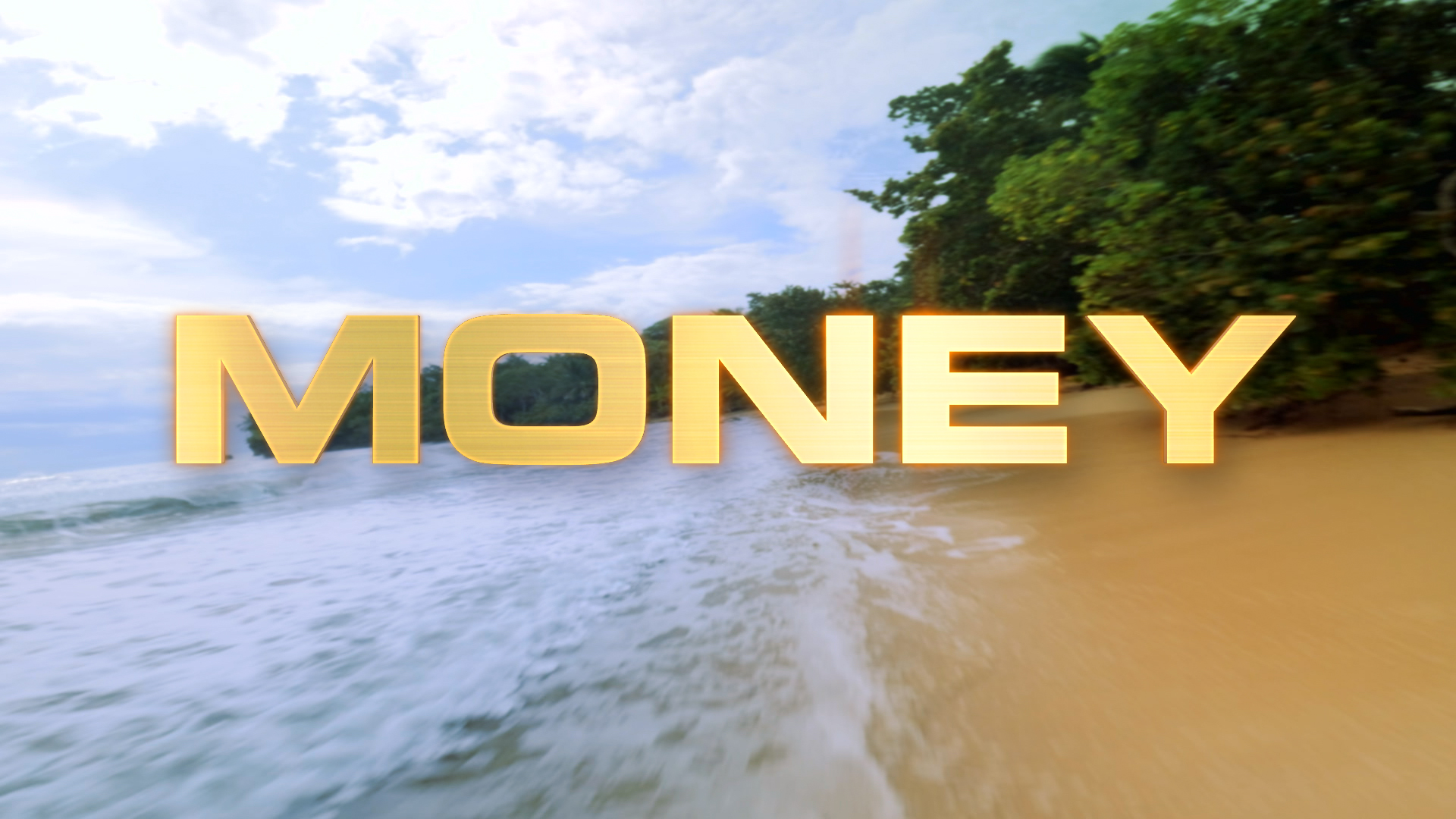
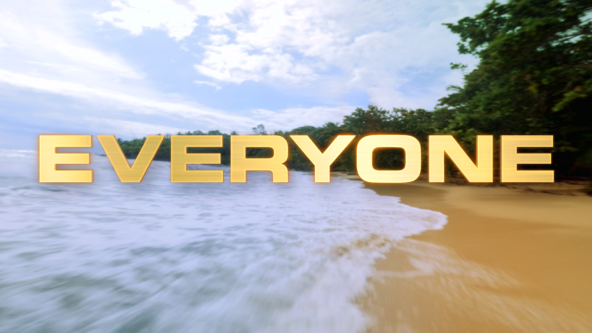
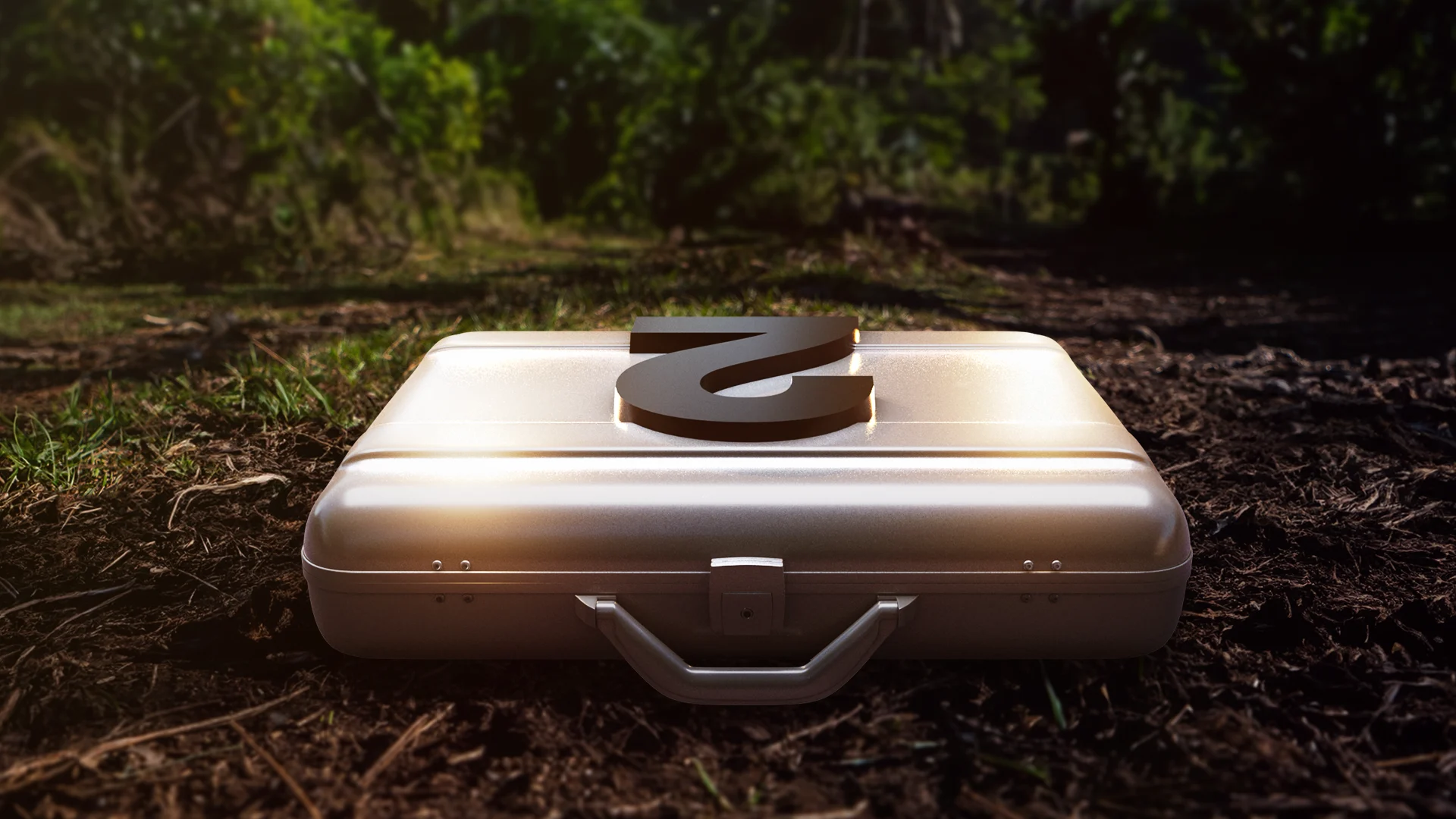
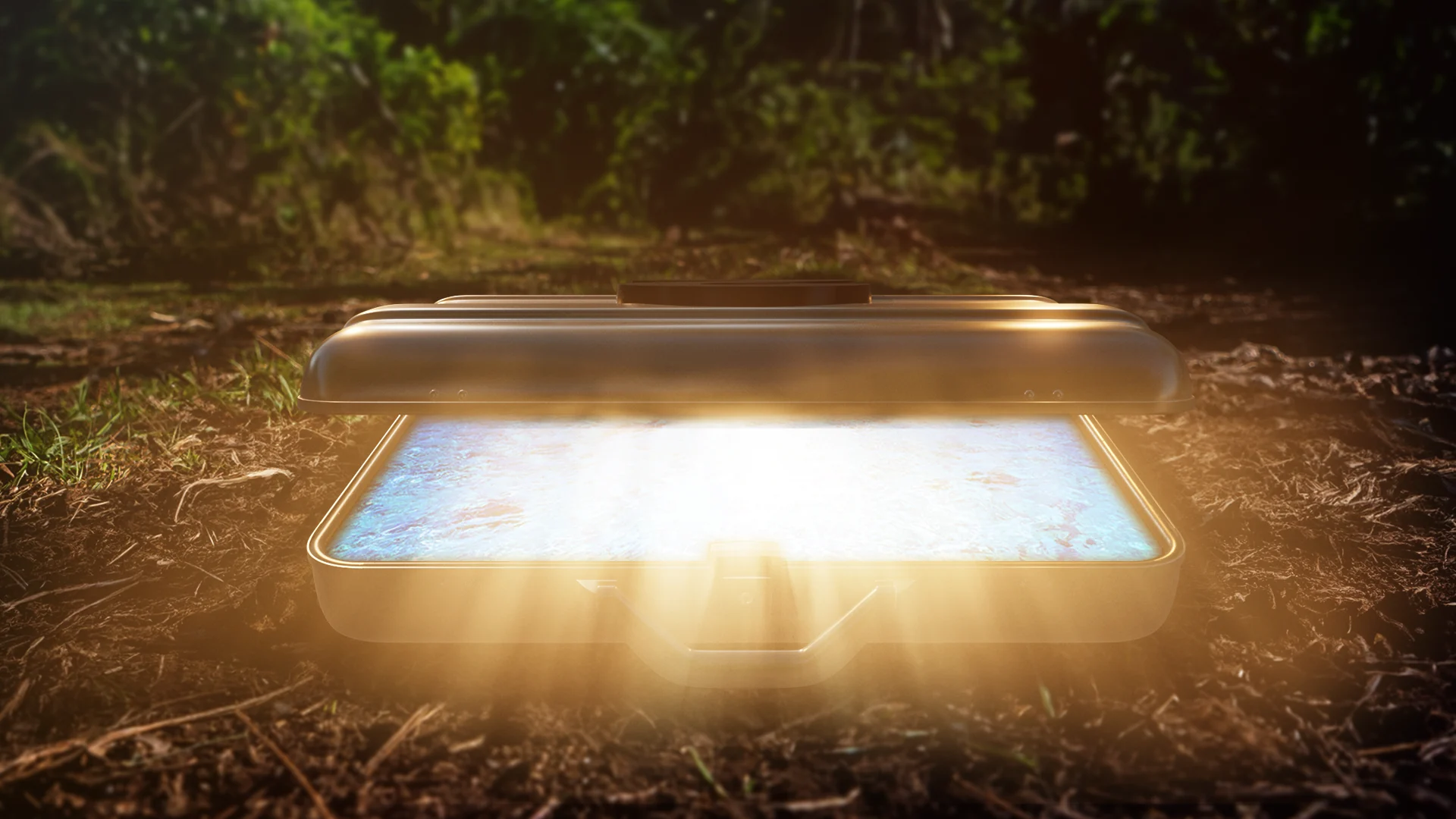
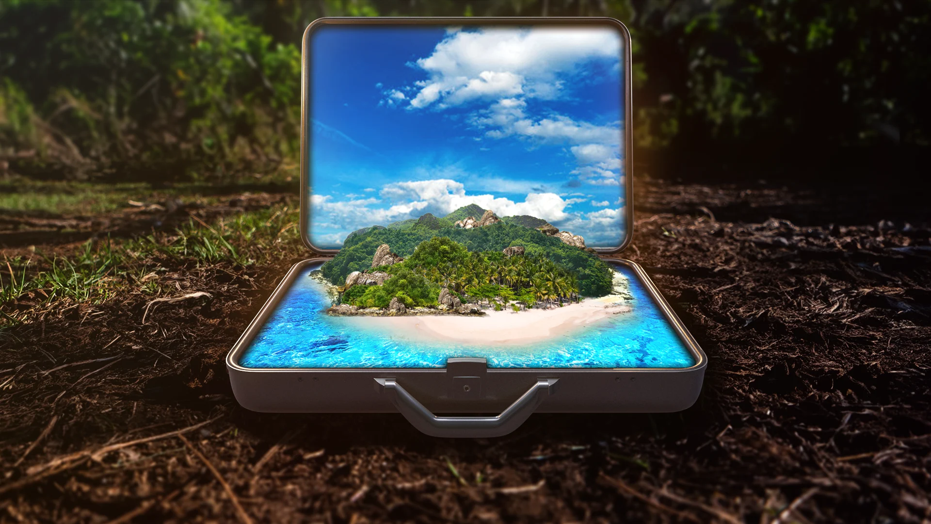
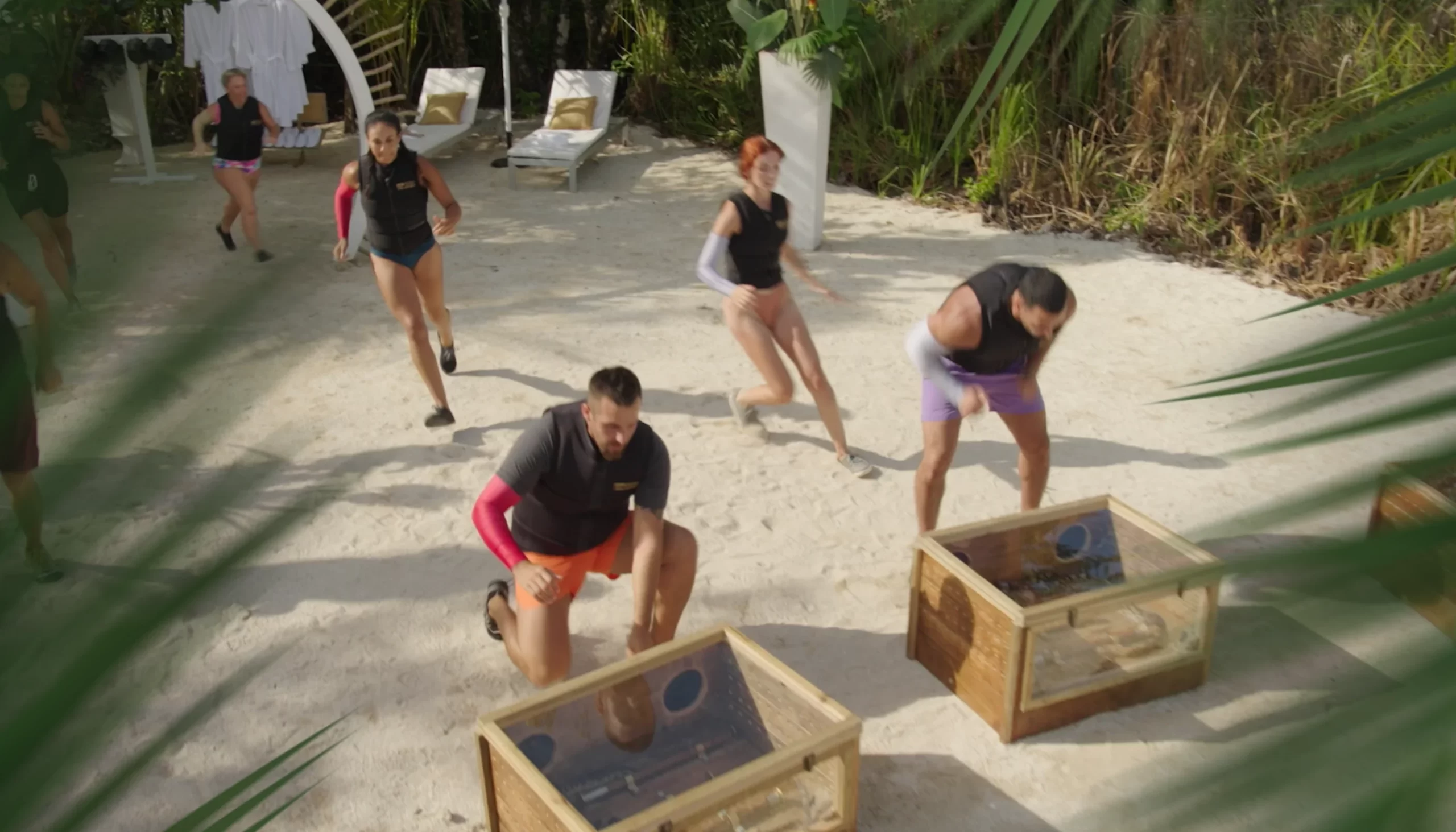
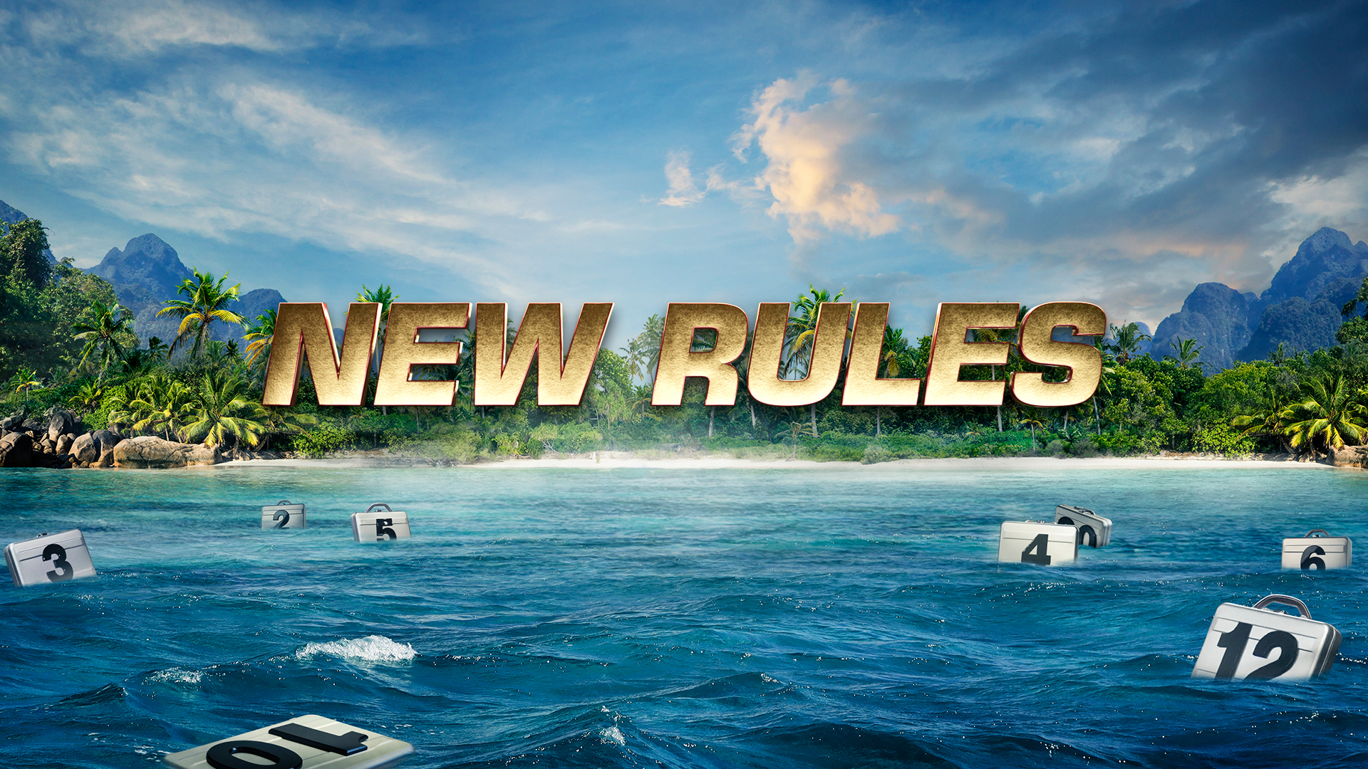
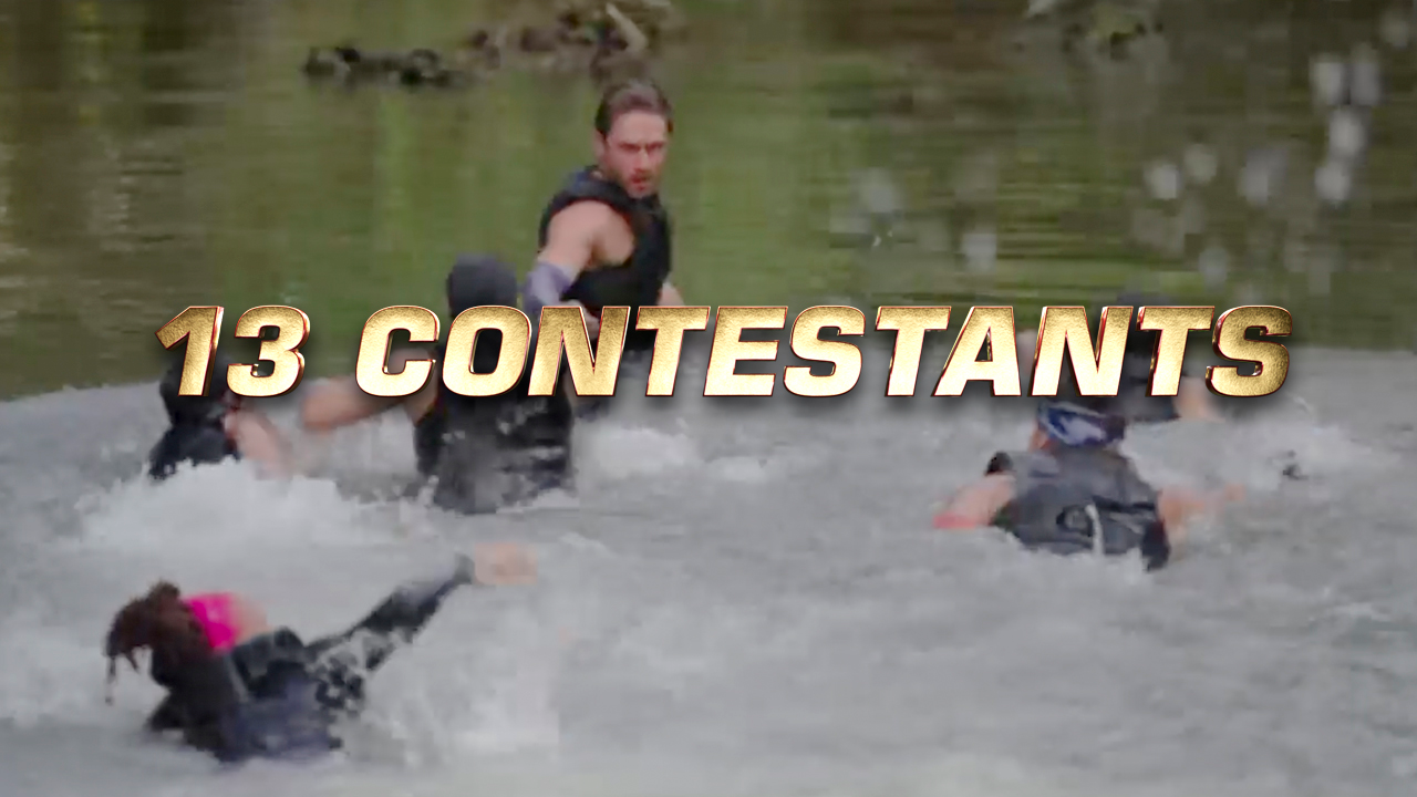
As part of the creative pitch, I brainstormed a tease open sequence titled “Beauty to Chaos” – an intro piece that transitions from a natural calm scenario into a chaotic world of challenges and drama. A way of highlighting the juxtaposition between the setting of paradise and the shows participants who’s high energy disrupted the calm.
Team:
VP Motion Design: Grant Okita
Motion CD: Jesús de Francisco
Designer: Martin Suyra
Designer/Animator: Jacob Vouniozos
Animator/Production: Todd Levalley, Gary Reisman
Challenges:
Promote the season without revealing to much within the graphics and the show footage do the heavy lifting. (this was discussed after the initial creative kickoff) There where a few different approaches we explored. The first creative mirrored what the Key Art team was exploring. We looked for ways to create a cohesive 360 campaign that gave the show a recognizable feel across all the different media placements. In the end we leaned into a look that let the message speak for itself as the show was revealed through a sequence of promos inspiring viewers to tune.
Concept Development:
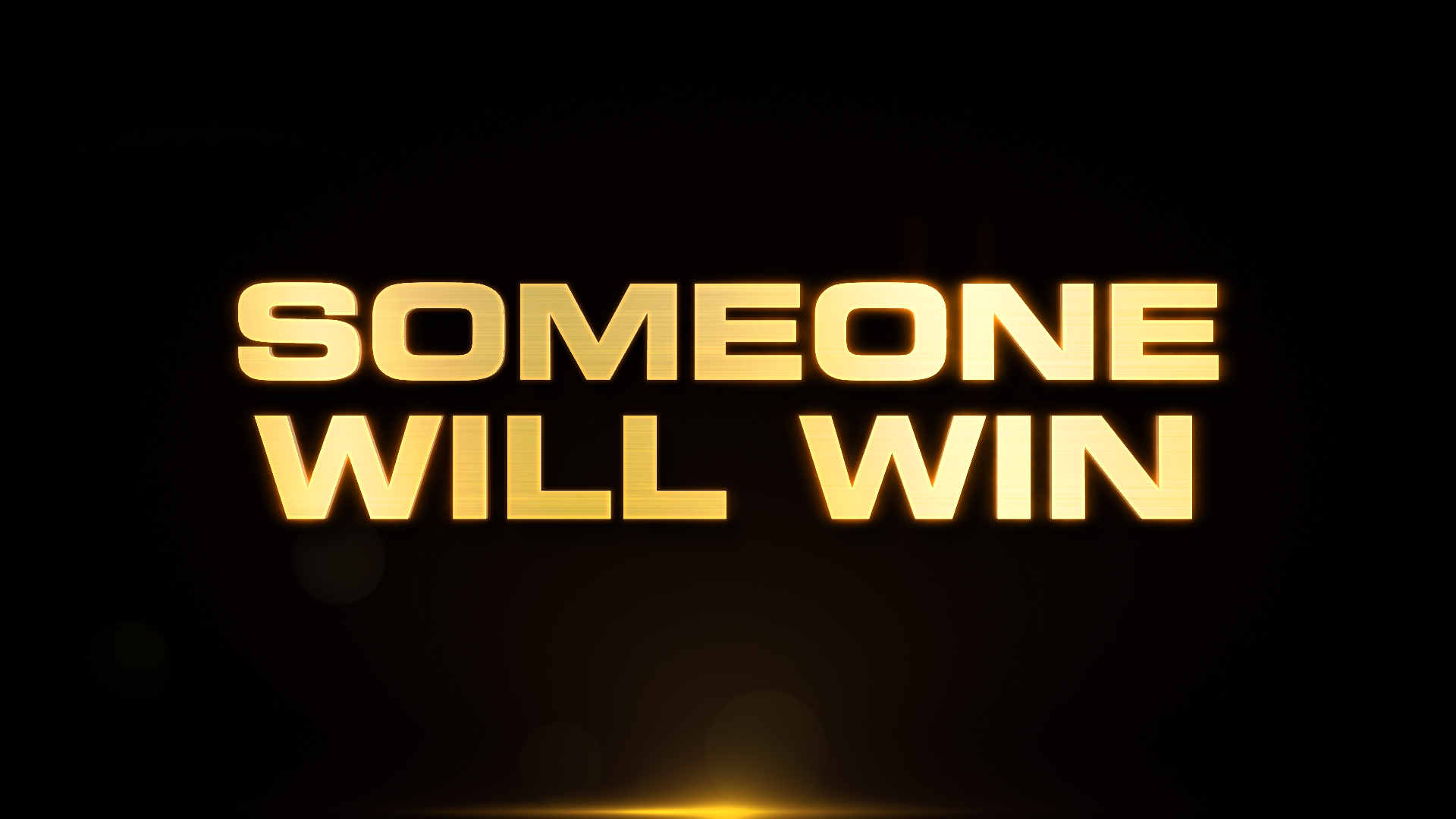
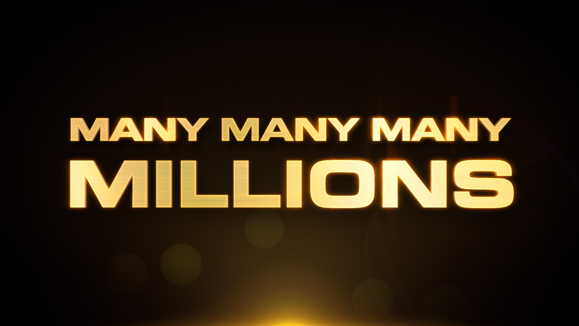
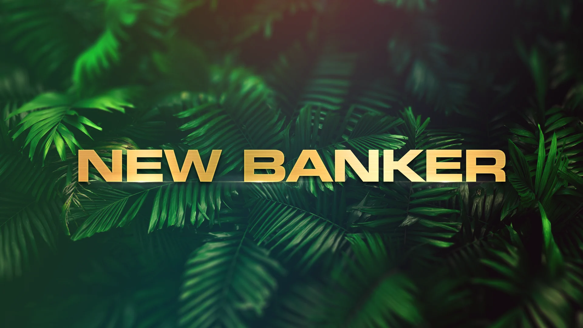
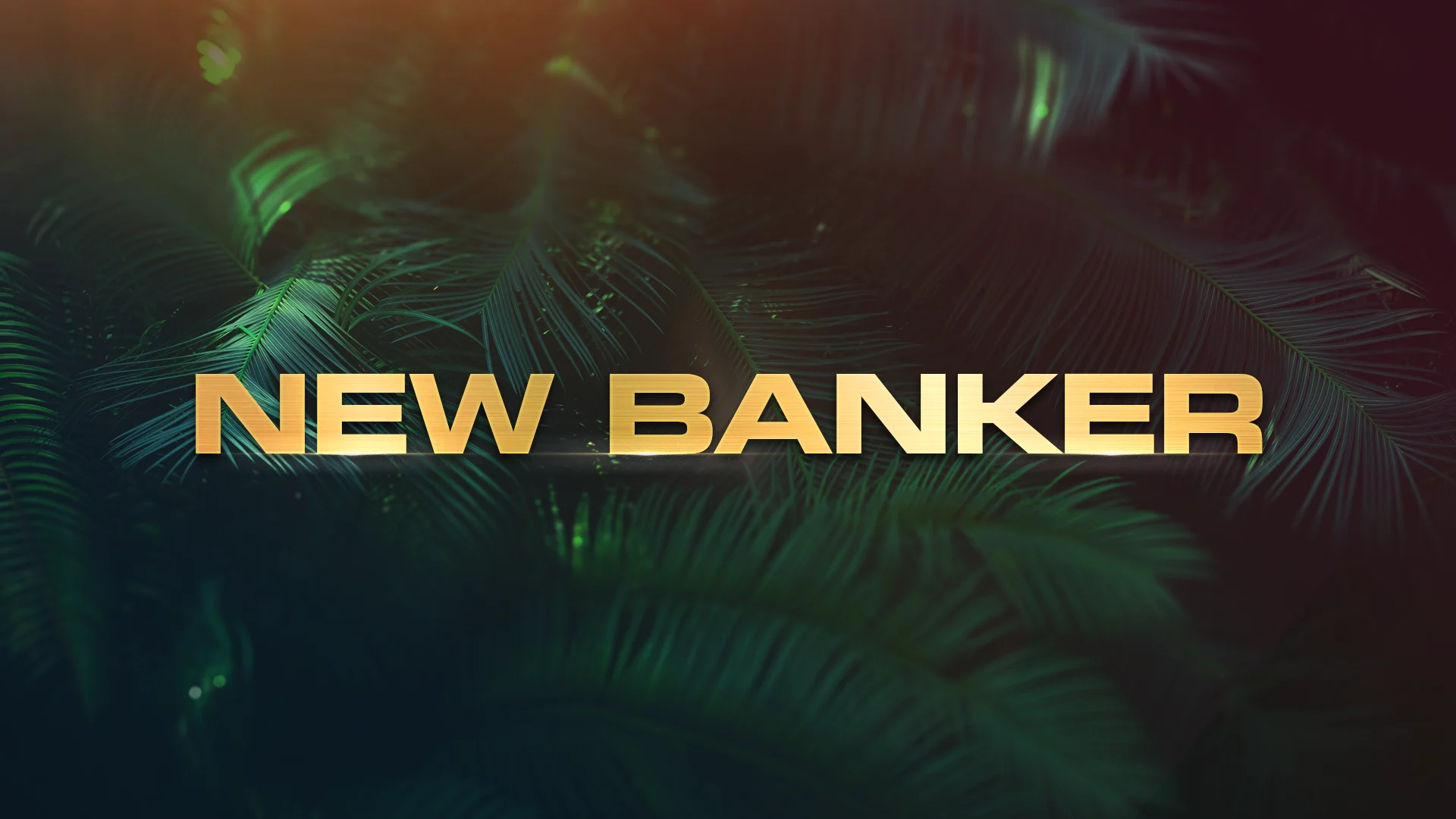
A few different type explorations where explored from textured gold to a unique red treatment we save for special occasions. We also designed a more robust Gold Glow type against black to tease the first few promos.
Technical Breakdown:
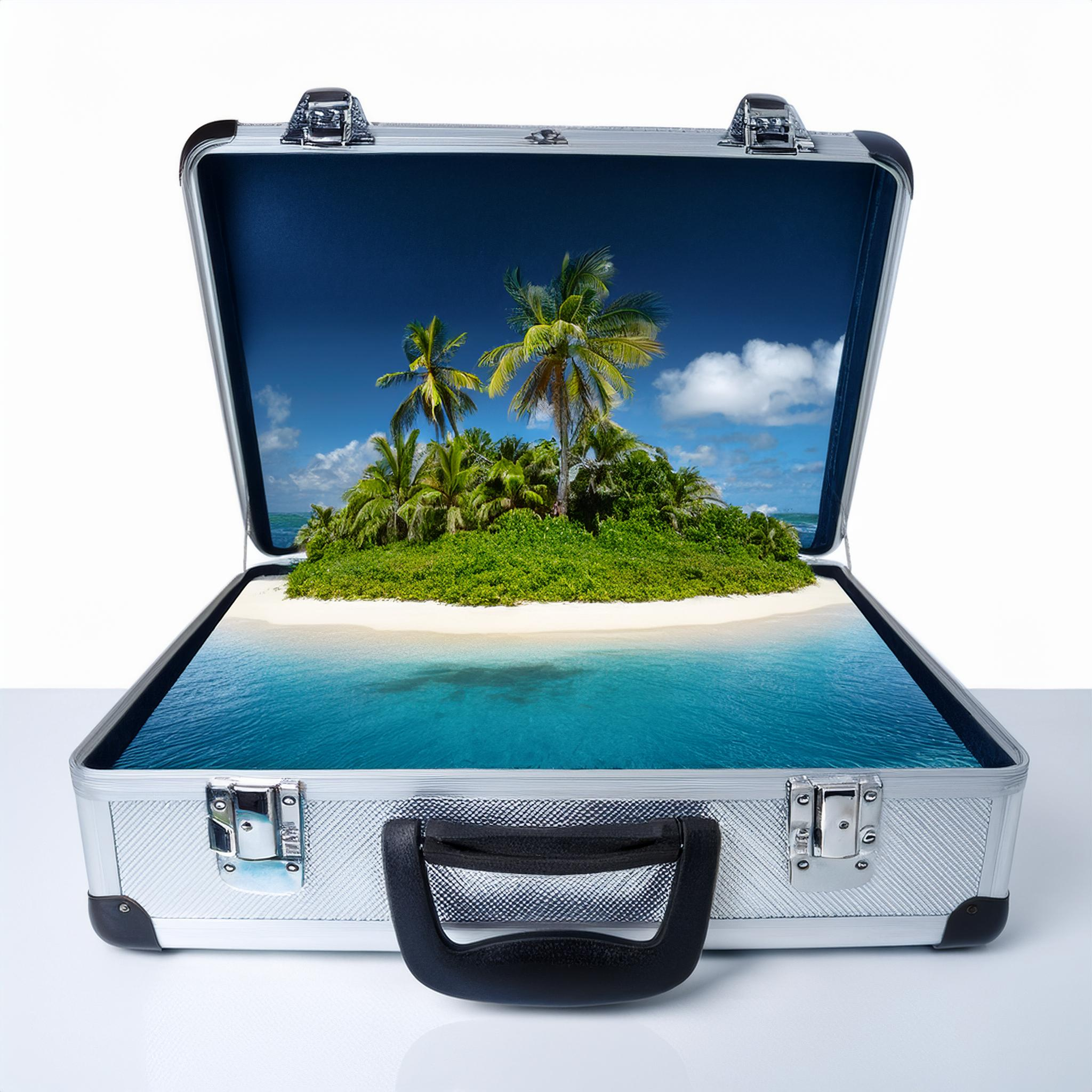
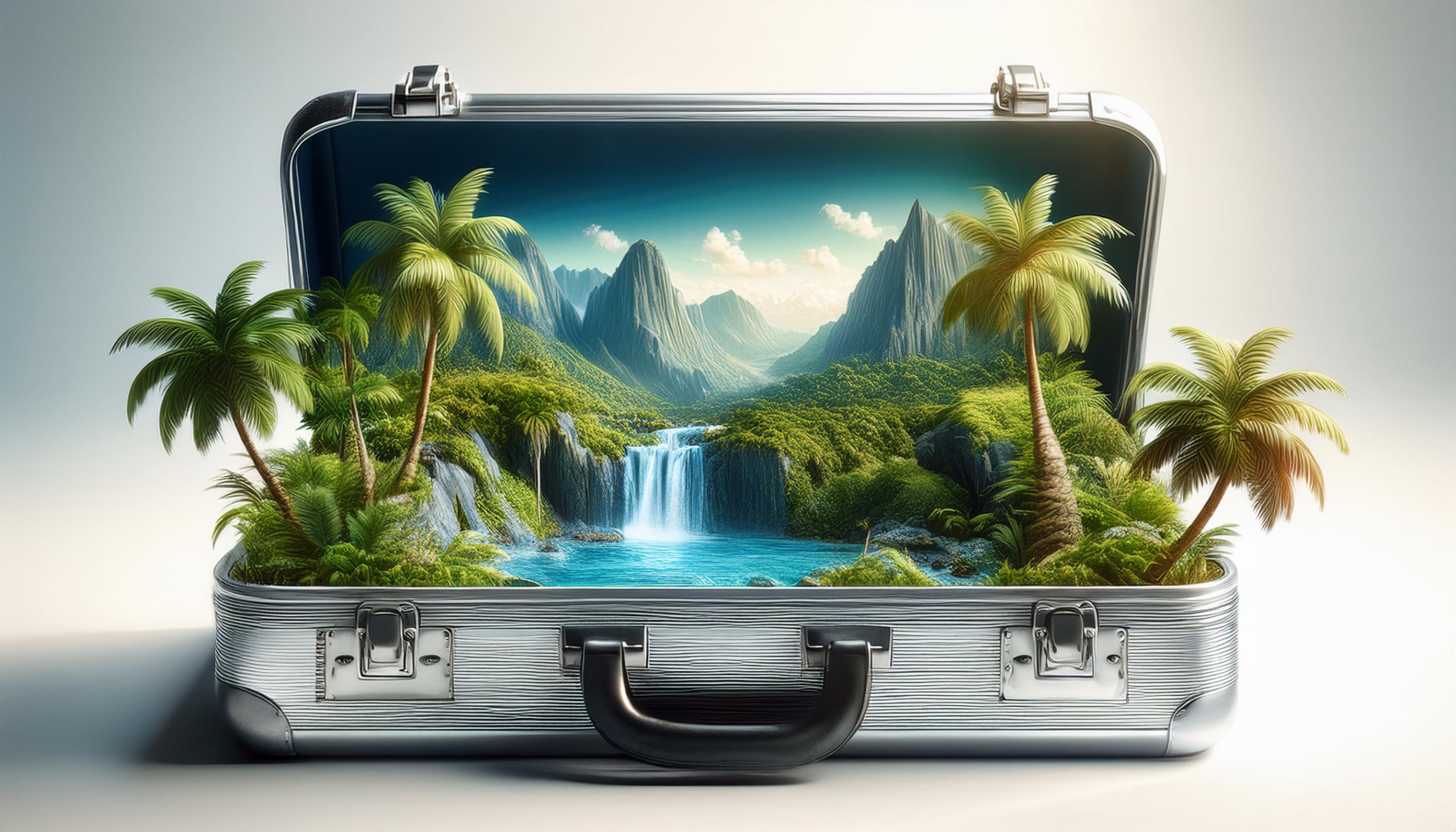
We leaned on After Effects creating type in 3D Element and setting up a production workflow that could meet a demanding schedule. There were a few spots with type integrated into the environment to create a more immersive experience. I explored a few concepts through Firefly AI, this was sort of the beginning of Adobe Firefly being introduced into the workflow. It helped establish how we could present the Island within the briefcase concept while still maintaining a realistic feel. This also gave me some guidance on how we could build this idea in Cinema4d
Key Takeaways:
We gave ourselves freedom to explore different ideas and creatives, that’s the part I love most. After working closely with the video creative team, a more conservative approach was taken that provided a nice balance between the graphics and show footage. This aligned with the marketing strategy, “Avoid misrepresenting the show and letting clips from each episode reveal the setting and assortment of challenges contestants had to participate in.” At some point you have to make sure goals are met and all the teams are aligned on the what that final creative is.